In April 2018, as part of the Heritage Lottery Funded ‘Pacific Currents’ project, the Museum of Archaeology and Anthropology (MAA) will open refurbished display cases showcasing objects from across the Pacific.
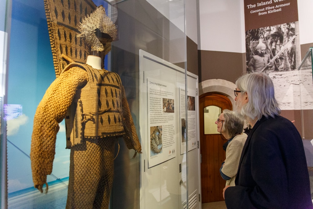
We want to ensure that these new displays address the needs and interests of our visitors and we also want to be able to measure the impact of the displays on our visitors’ understanding of the Pacific. So, in autumn 2017, we undertook four days of gallery evaluation, to see how visitors were using our short-term Pacific exhibitions (Island Warrior and Swish) as well as to learn more about what they already knew or thought about the Pacific. The evaluation was carried out by myself, and supervised by Sarah-Jane Harknett, Outreach Organiser.
I spend most of my time at MAA talking to groups of young people visiting the museum. But despite this, I was more than a little hesitant about gallery evaluation. I was convinced that every visitor would try to avoid the strange figure in the corner of the gallery with her clipboard, lanyard and slightly too hopeful expression. And to begin with it seemed like I was right: I had ten refusals on my first day. This terrified me so much, that I had to go into my second day of gallery evaluation with a full face of makeup. I saw a 90% reduction in refusals and became convinced our visitors were terribly superficial. But after another day or two of evaluation sans makeup, I realised the reduction in refusals was more to do with my growing confidence and clearer explanations of the activities. Which was relieving.
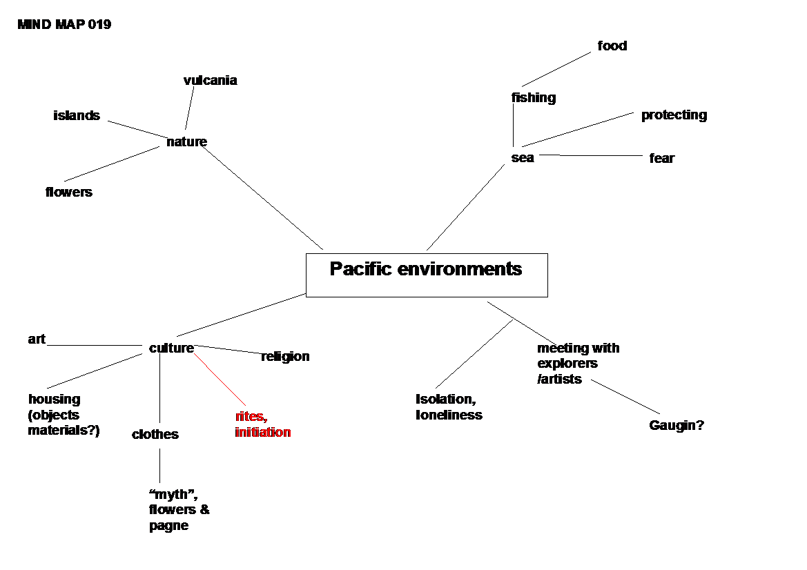
We used two different methods. Firstly, an interview with set questions to evaluate how visitors were looking at the displays and secondly, mind maps to see what associations, ideas and images our visitors already have with the Pacific. A mind map has a target phrase in the middle of a sheet of paper and we ask visitors to write or draw any words, ideas or phrases that they associate with this target phrase around it. Visitors drew a mind map before looking at the Pacific exhibition, then they would be asked to view the displays and add any new thoughts or ideas to their mind map in a different colour. You can see an example below. The red items were added in after viewing the exhibition. Mind maps are a powerful tool for understanding people’s thought processes and to measure their learning.
After four days of evaluation, MAA wonder-volunteer (and autism accessibility guru) Melanie Hugow patiently waded through and typed up my scrawled notes on 30 mind maps and interviews. I gave myself two days to write the report because I had never written a report like this before and two days seemed like plenty of time. But as soon as I sat down to my computer in December to write up my findings, I came up against a big problem. What exactly were my findings? What was it that I had found out? I really wasn’t sure.
I started looking around for ways to analyse my data. I relied heavily on Sarah-Jane’s University of Cambridge Museums (UCM) reports. Her July 2016 evaluation of the Sedgwick Museum helped me organise and analyse the answers to the interview questions. But the mind maps were harder. I wrote panicked emails to my husband, a user experience researcher for digital government projects. I re-read Sarah-Jane’s report on the Religion and Devotion exhibition at the Fitzwilliam Museum, which had also used mind maps. I found more articles online about qualitative vs quantitative analysis and, gradually, I started to find my footing. By the end of the second day of report writing, I felt like I was getting to grips with the patterns and trends. I thought it might take one or two more hours to finish it off the next morning. By the end of my third day of report writing, I was 30 pages in and feeling like I could analyse data for days, if not weeks; it was all so interesting and there were so many patterns and ideas to explore. A few hours into the fourth day of report writing, I realised I had to wrap it all up and quickly or the people who needed to read it would never get it.
The most important things that I think MAA will need to address in the displays is that firstly, visitors demonstrated a lot of confusion over what is meant by ‘the Pacific’ and where it is. Visitors wanted to know if the Pacific included Australia, Thailand or China. They were easily confused between the Atlantic and the Pacific. They relied heavily on their personal experience for their definitions, like the Canadian tourist who wrote only about the Pacific North-West of Canada. Secondly, a lot of visitors didn’t make use of the interpretation that was available to them. They picked out small pieces of information, but might miss the larger point that a curator is trying to make. This is particularly important, as MAA’s redisplay aims to track the impact of broad themes like migration and climate change on Pacific cultures. These are complex ideas that will need to be expressed succinctly and engagingly if they are to have an impact on visitors’ understanding. Personally, it was interesting to realise that so many visitors to MAA are actually tourists. As I most often work with school groups and families, I sometimes get a skewed view of the people coming into the museum.
In the end, I found the evaluation challenging, rewarding and enlightening. I hope that my colleagues will find it as useful as I have. I also feel like I’ve developed many skills, which I hope to be able to use again. And I’m goofily, embarrassingly proud of the report I managed to write, which is always a lovely feeling after completing a piece of demanding work.