On Remembrance Sunday 2018 it will be one hundred years since the signing of the Armistice agreement, at the 11th hour, on the 11th day, of the 11th month, which effectively brought an end to the First World War.
To mark the occasion, this blog explores the making and meaning of a portfolio of lithographic prints which were commissioned by the British Government’s propaganda department in 1917. The prints were published by The Avenue Press. The set at the Fitzwilliam Museum, still in its original ‘Avenue Press’ mounts, was recently catalogued and researched. It was given to the Museum by the Ministry of Information in 1919.
What are lithographic prints?
Lithography (from Ancient Greek; ‘lithos’, ‘stone’ and ‘graphein’, ‘to write’) is a printing process first invented by German playwright, Aloys Senefelder in 1796, whose need to find a cheap method of printing his plays led to experimentation with a greasy, acid resistant ink and limestone and resulted in the discovery that he could produce prints from a flat surface. The technique is founded on the principle that water and oil don’t mix. Greasy ink or crayon is applied to a semi-porous surface like stone, the blank parts of which are made receptive to water which will then reject the printing ink, whilst the areas drawn with the greasy ink or crayon will attract it.
The ‘Efforts’ and ‘Ideals’ project of 1917
‘[A] first attempt by a number of British artists working in unison to put on record some aspects of the activities called forth by the Great War, and the Ideals by which those activities are inspired.’
– Foreword, exhibition catalogue, Fine Art Society, July 1917
At the beginning of 1917, following three years of fighting with nearly half a million British men dead and no end in sight, it became crucial for the British government to maintain public support for the war in France.
To this end, a new Department of Information (later renamed Ministry of Information) was created in February 1917 to centralise and intensify Britain’s propaganda efforts.
In charge of visual propaganda and war art was writer and Liberal MP, Charles Masterman, who received a proposal in early 1917 from the illustrator, Thomas Derrick, the lithographer, Francis Ernest Jackson and Campbell Dodgson, Keeper of Prints and Drawings at the British Museum.
Their idea was that the Government should commission an ambitious print portfolio scheme involving twenty artists (this was later reduced to eighteen) who would produce sixty-six lithographs between them in limited editions of two hundred. The project, called The Great War: Britain’s Efforts and Ideals, which has since been described as the most ambitious print publication project of either world war, would herald the new and invigorated approach to visual propaganda from 1917.
Commissioning the artists
Ernest Jackson had been teaching lithography to artists since 1902 at various London County Council Art Schools and was already lithographic advisor to the Department of Information when ‘Efforts’ and ‘Ideals’ was proposed. He was tasked with approaching the artists, supplying them with materials and instructing those new to lithography. He provided proofs for the artists’ inspection so that they could see what to add or alter and oversaw the final printing. Jackson produced one of the project’s ‘Ideals’ (see above) which portrays England and France fighting off Imperial Germany.
There were many well-known names on the list of artists commissioned to undertake the project.
Older, established figures such as Augustus John, Frank Brangwyn, William Nicholson, William Rothenstein and George Clausen were joined by C.R.W. Nevinson and Eric Kennington, both younger artists, who had fought or worked on the front lines in France. They were included because it was felt that the stamp of authenticity offered by artists who had actually experienced the war first hand would contribute to the success of the project.
Many of the artists employed on the scheme had already produced and exhibited or published work on the subject of the war or in support of the war effort, either in an official or unofficial capacity.
Propaganda at home and abroad
The division of the portfolio into ‘Efforts’ and ‘Ideals’ worked as a two-pronged propaganda offensive aimed at audiences abroad as well as at home.
The ‘Ideals’
A major objective of the Department of Information in early 1917 was to encourage the neutral U.S. to join in the fighting on the side of the British and French.
The twelve, large, coloured lithographs of the ‘Ideals’, each designed by a different artist, presented the war in symbolic terms using allegory and historical reference. They addressed the question of why Britain was at war and what it aimed to achieve. The ‘Ideals’ also aimed to convey the justness and fair-mindedness of Britain’s fight and to promote the idea especially attractive to a neutral audience – that Britain and its allies were on the winning side.
The ‘Efforts’
The fifty-four prints relating to the ‘Efforts’ section of the portfolio were commissioned from nine artists on subjects allocated by Masterman at the Department of Information. Each artist was instructed to produce six drawings relating to their nominated theme and according to censorship guidelines. Many of the subject titles – ‘Making Soldiers’, ‘Making Sailors’, ‘Making Guns’, ‘Building Ships’, ‘Building Aircraft’ – presented the war as a creative rather than a destructive process.
The ‘Efforts’ were all printed in monochrome. They were also smaller in size than the ‘Ideals’ and their comparative simplicity conveyed the sense that they were honest records of real war work. The ‘Efforts’ were directed at the people of Britain, from volunteers or conscripts into the army, to munitioneers and the builders of aircraft and ships. The images aimed to boost morale by demonstrating how important their contributions were.
Taken as a whole the portfolio was designed to remind people of the aims and objectives of the war and emphasise the importance of patriotic duty.
The prints were exhibited in public for the first time at the Fine Art Society in London in July 1917. Their portability in comparison with large oil paintings meant that they could also be more widely exhibited and distributed. They toured numerous venues around the UK and were additionally displayed abroad to allied audiences in Paris and in New York and Los Angeles in the U.S.
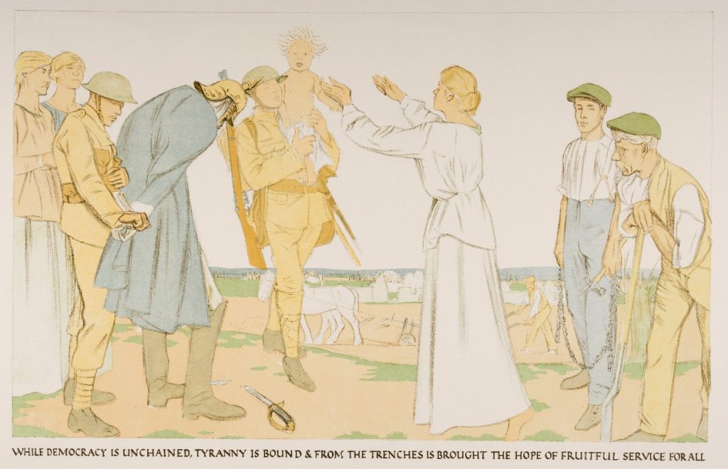
Pro-war propaganda presented Britain’s cause as fair and just in contrast to the dictatorial and extremist behaviour of Germany and its allies. By sharing a vision of Britain as victorious over Germany (both countries represented by soldiers in uniform), Rothenstein reminds people of the values of British society and the importance of fighting for them. In this allegorical image where characters are used to represent abstract ideas, the German solider under arrest on the left represents ‘Tyranny’, the female figure in white at the centre is ‘Democracy’ and the child carried by the British soldier stands for ‘Hope’.
Rothenstein contributed this ‘Ideal’ and six drawings for ‘Efforts’ on the subject of ‘Work on the Land’. He was appointed an official war artist in December 1917 on the strength of his work for ‘Efforts’ and ‘Ideals’.
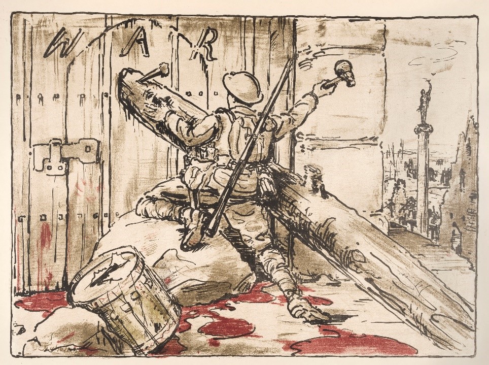
In Nicholson’s image (above) the human cost is indicated in the bloody pool and handprint and the skull-like hammer which is used by the British soldier to bar the door leading to war. The message reinforces the idea that the sacrifice is justified if it means that war will end forever. The image was viewed in a positive light, with one critic stating: ‘I fell to completest content in front of William Nicholson’s ‘End of War’. Nothing could be better than the sentiment and its expression’.
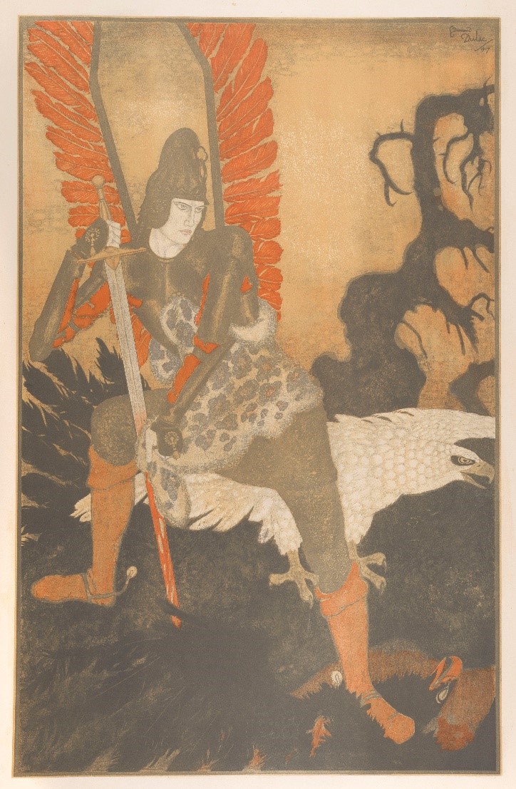
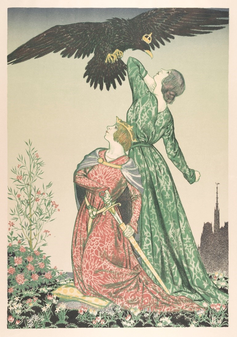
In this striking image, a Polish Hussar stands over the corpse of a giant black eagle symbolising Imperial Germany. He wipes his bloody sword on the leopard skin worn across his body. A white eagle, the national symbol of Poland, spreads its wings behind him.
The Winged Hussars were the elite cavalrymen of the Polish army from the sixteenth to the eighteenth century. Dulac’s portrayal of the Hussar references national pride and a golden age of Polish military might. In fact, Poland was a borderless nation within Austria-Hungary during the First World War and was involved in the fighting on both sides along the Eastern front. The black, blasted tree trunk at the far right, by this time an iconic symbol of the war’s destruction, is visually aligned with the blackness of the German imperial eagle. In Dulac’s image, Poland and its army is positioned as firmly on the allied side.
Edmund Dulac was known for the jewel-like watercolours influenced by oriental and near-eastern art which he created for deluxe edition illustrated books. He was already associated with the Department of Information when he was commissioned to work on ‘Efforts’ and ‘Ideals’ and had contributed illustrations to a number of ‘gift’ books sold to raise money for war charities.
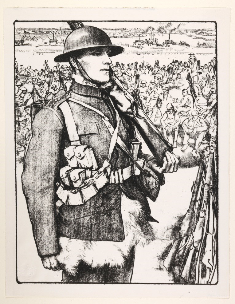
Eric Kennington had served as a private in the Thirteenth Battalion the London Regiment (The Kensingtons) in northern France until he was given an honourable medical discharge in June 1915. He had exhibited a painting of himself with his regiment and drawings of a visit to the Somme battlefield in 1916.
At the Department of Information, Charles Masterman thought that he would therefore be best suited to the theme of ‘Making Soldiers’. Kennington’s six drawings for the ‘Efforts’ depict the process of training undertaken by conscripts into the army. After only three months of intensive training these new soldiers were sent to the front to fight. Ready for Service is the third number and shows a soldier in profile standing in the foreground, looking into the distance. He wears one of the sleeveless goatskins referred to as ‘Woolly Bears’ or ‘Teddy Bears’ which were issued to soldiers in France during the cold winters. Kennington’s drawings seem to follow one soldier through the process, but avoid imprinting individual identity by employing oblique views, deep shadow and, in one image, gas masks.
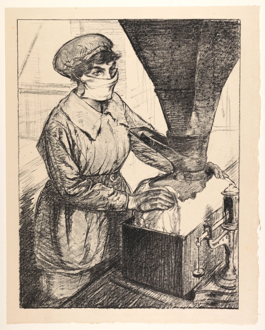
This image of a woman packing the explosive T.N.T. is one of three of the six produced by Hartrick to focus on the work of female munitioneers. By 1917, almost 1 million women were working in the munitions industry to make the shells and bullets required to arm allied soldiers. The woman depicted was described as ‘A Heroine of Munitions’ in the Illustrated London News during coverage of the first public exhibition of the lithographs in July 1917. This label would seem to be a particularly apt one for Hartrick’s deliberately posed portrayal of the woman as a commanding figure, full of courage and confidence. The protective face mask appears more like a veil, adding even a thrill of the unknown to the depiction. Hartrick’s propaganda images do not present the realities of working with T.N.T., which was incredibly dangerous and caused deaths from prolonged exposure. The sulphuric acid used to make the explosive stained anything it touched, including skin and hair. Hartrick himself commented in his autobiography on how one of the women he was drawing had been turned yellow from the chemicals, but this remains unacknowledged in the ‘Efforts’ posed, monochromatic portrayals.
C.R.W. Nevinson had exhibited many oil paintings and prints at London galleries which related to his experiences from 1914 as a volunteer ambulance driver and between 1915 and 1916, as a private in the Royal Army Medical Corps.
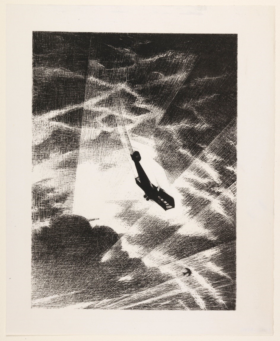
Nevinson had already depicted allied and enemy planes in the skies over France and so for ‘Efforts’ and ‘Ideals’ he was tasked with recording the manufacture and deployment of aircraft. He visited factories in north London and Norfolk to make drawings and took the first of many flights in an aeroplane to create the two lithographs which represent the pilot’s eye-view. Commenting later on his flying experiences he described how ‘the whole newness of vision and the excitement of it, infected my work and gave it an enthusiasm which can be felt’. In Swooping down on a Taube, the final image of the six produced by Nevinson, an allied plane can be seen falling through a sky lit up by searchlights to destroy a Taube (meaning ‘Dove’ in German). The Taube was a German reconnaissance plane with curved wings like a bird (hence the name) which carried bombs that could be thrown from the cockpit. Nevinson’s lithograph portrays the positive impact of British efforts rather than the negative effects of enemy action – i.e. the destruction caused by the Taube’s bombs. The power of this image to stir and inspire led to the Taube caught in searchlights to be likened to ‘Satan flying … from Paradise chased by the swords of the Seraphim’.
The ‘Efforts’ and ‘Ideals’ artists, lithography and the Senefelder Club
‘Artists have studied in the schools, bought their own presses, found new ways of working and the revival has come about, the tide has turned’.
Joseph Pennell, ‘The Senefelder Club and the revival of artistic lithography’, The Studio, February 1914
The second decade of the twentieth century witnessed a new impetus for the printmaking technique of lithography in England. Francis Ernest Jackson, the technical advisor to the ‘Efforts’ and ‘Ideals’ series, was a major figure in its revival as a dynamic medium with innovative possibilities. Jackson, who had been apprenticed to a commercial lithographer and trained in Paris, was influenced by the earlier renewal of interest in lithography among artists in France and by Whistler’s experiments with lithography in London.
The rise of the artistic lithograph in England was marked by the establishment of the Senefelder Club in 1910. Jackson was a founder member, along with Archibald Standish Hartrick, another contributor to ‘Efforts’ and ‘Ideals’. The Club took its name from the eighteenth-century inventor of the technique and promoted lithography as worthy of artistic exploration and against the view of the lithograph as a cheap method of commercial reproduction. Other contributors to the ‘Efforts’ and ‘Ideals’ project, such as Charles Shannon, Charles Ricketts and Frank Brangwyn were members of the Club or regularly showed their work in its annual London exhibitions. Campbell Dodgson was an honorary member. C.R.W. Nevinson had been taught lithography by Jackson in 1912 and it was the lithographs which he displayed at the Senefelder Club early in 1917, seen by Campbell Dodgson, which led to his recommendation for ‘Efforts’ and ‘Ideals’.
Transfer lithography
A particular technique employed by artist lithographers associated with the Senefelder Club was transfer lithography and the majority of the lithographs in the ‘Efforts’ and ‘Ideals’ portfolio were created in this way. In transfer lithography the design is drawn onto specially-prepared paper which is then transferred onto the lithographic stone and printed.
The transfer method, which was widely used in commercial lithography, was reclaimed by artists during this period. A sheet of paper was more convenient to work on than a heavy slab of stone and enabled greater immediacy of expression and possibility for experimentation. The double reversal (paper onto stone and then back onto paper) also meant that the resulting lithograph was in the same direction as the original drawing.
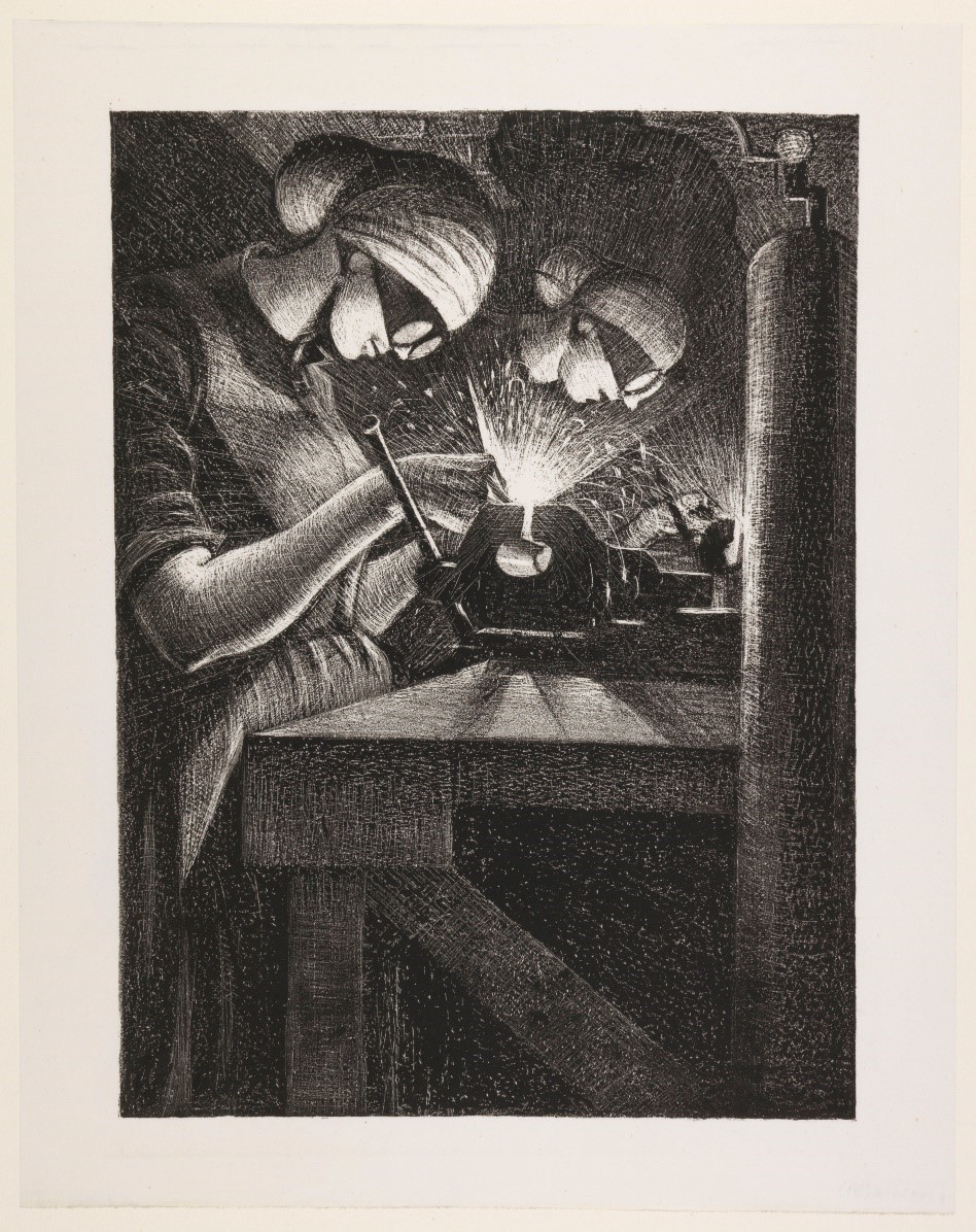
The coating on the transfer paper enabled artists to exploit subtractive techniques, such as scratching and scraping, to create broad or fine highlights which could lend texture to their compositions. Scratching to create points of light is seen to dramatic effect in a number of the monochromatic ‘Efforts’ lithographs, such as C.R.W. Nevinson’s, Acetylene Welder.
Colour
The coloured lithographs of the ‘Ideals’ are notable for their simplicity. Ernest Jackson was cautious about the use of colour and a reduced colour palette among artist lithographers working during this period was common. In colour lithography, a keystone is first created which holds the main drawing and outlines. Subsequent stones for each different colour have then to be created and inked up and then overprinted. The number of ‘colour’ stones created for the twelve ‘Ideals’ ranges from between two and five.
The works reproduced by Archibald Standish Hartrick and Eric Henri Kennington were commissioned by the Department of Information in 1917 and so fell under Crown Copyright, which has now expired. See: http://www.nationalarchives.gov.uk/information-management/re-using-public-sector-information/uk-government-licensing-framework/crown-copyright