As a curator, I want to make visitors stop in their tracks, look, think, and engage. I want to confront, critique, and challenge. High ideals for sure but great art is powerful, provocative and profound, and has the ability, especially when mediated through careful curation, to transcend and transform.
Sensual/Virtual: Two Coloured Sculptures juxtaposes two masterpieces of carved and painted wood sculpture on temporary loan to the Fitzwilliam Museum: St Sebastian made by Spanish Renaissance artist Alonso Berruguete in the 1530s, and Action 125: Tikrit city, Iraq, Prisoner of war. Monday, April 14, 2003 made by Iranian-born, London-based artist Reza Aramesh in 2011. This display focusses on suffering and subjugation, violation and victimisation. While small in scale it certainly packs a punch. And it could not be more relevant as we continue to grapple with the ravages of the Covid-19 pandemic and violent protest, persecution and suppression across the globe.
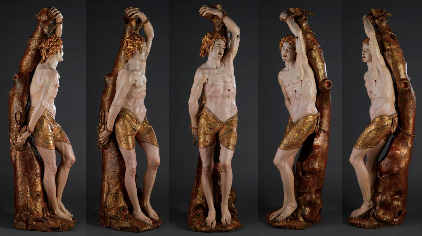
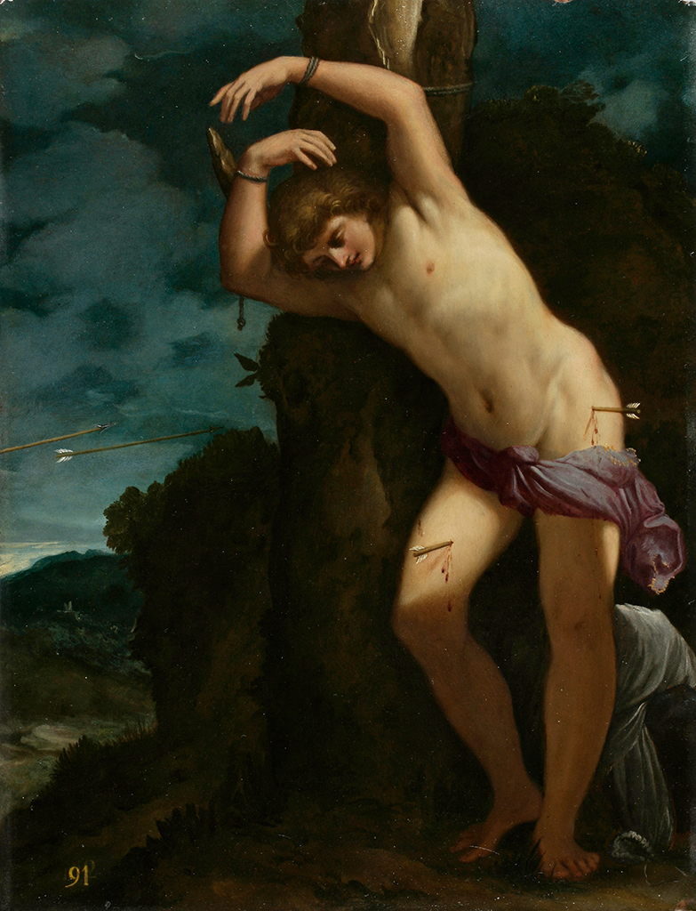
Berruguete’s St Sebastian portrays an ancient Roman army general who was martyred for his Christian faith by the anti-Christian Emperor Diocletian in 283 AD. Shot through with arrows, he was miraculously nursed back to health, only to be martyred by being stoned to death. The cult of St Sebastian became widespread in Catholic Europe from the 1400s, as it was believed that he could cure believers of the plague. The Martyrdom of St Sebastian was a subject favoured by Renaissance artists as it gave them a legitimate excuse to portray an almost nude, idealised male body, within religious contexts and spaces, as can be seen here, in Ludovico Carracci’s highly sensual interpretation of this subject, made half a century or so after Berruguete’s statue.

Berruguete had studied in Italy and Sebastian’s pose is based on The Dying Slave, a famous marble sculpture by Michelangelo with undeniably erotic overtones. But Berruguete’s St Sebastian was not intended as an elevated work of art. Instead it was made to inspire popular religious devotion, to make a community feel protected. It may have been made as part of a large multi-figure altarpiece or, more likely, as a stand-alone sculpture that could be carried through the streets in holy processions, similar to those that still take place today all over Spain. Church commentators at the time worried however that the realistic nudity of such images would cause inappropriate desire. It would be interesting to discover how long St Sebastian, beautiful and suffering, has been associated with gay identity, as he is now.
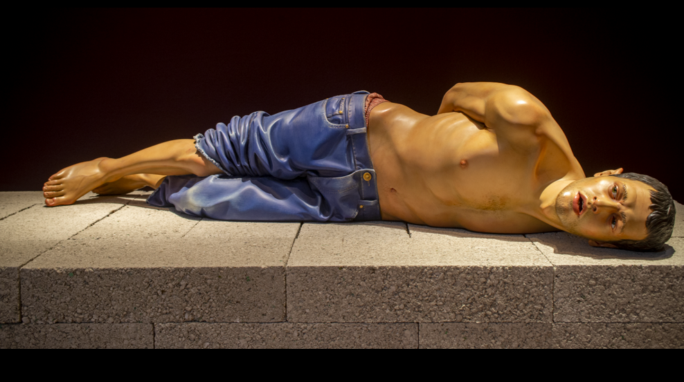
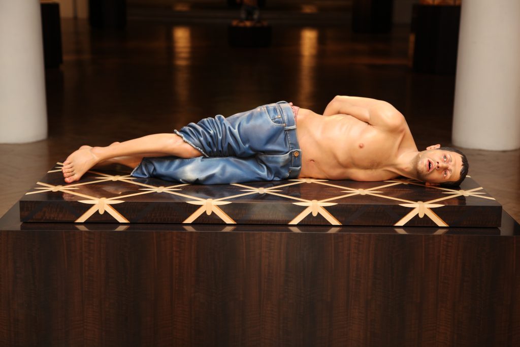
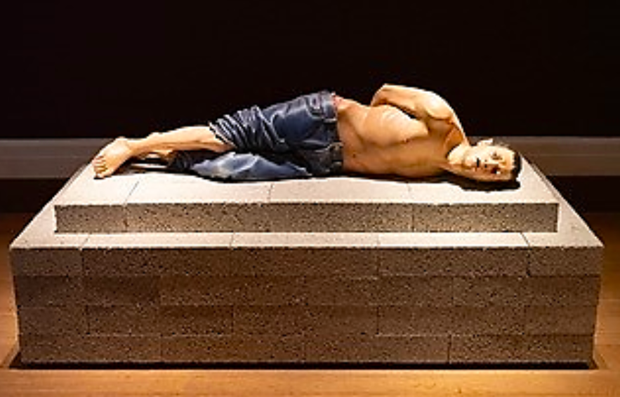
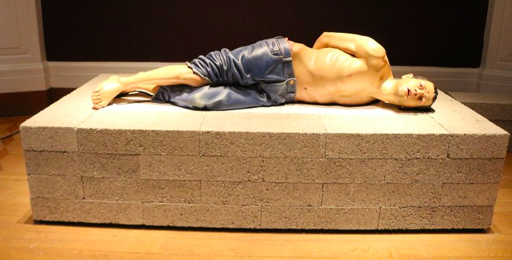
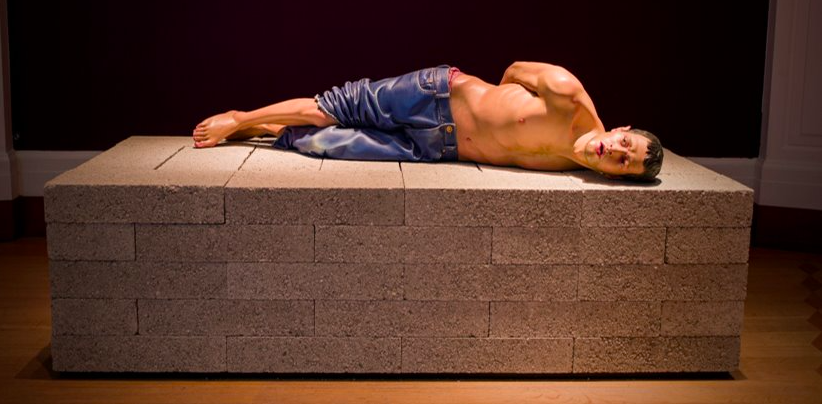
Aramesh’s Action 125 is a contemporary political subject, a Muslim Iraqi prisoner of war captured by invading American forces in Tikrit, Northern Iraq, on 14 April 2003, at the start of the Iraq War (2003–2011). Seen here as a stand-alone piece, it was made in 2010–11 as part of a larger Action series, nine sculptures each representing an act of subjugation. Each shows a lone male victim forced to strip down – and thus left exposed, humiliated, and vulnerable.
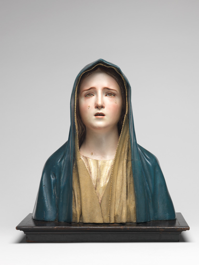
Aramesh’s haunting and unnerving ‘icons of beauty and terror’ derive from two key types of visual sources. The first are beautiful, highly-finished Renaissance and Baroque sculptures and paintings of saints in agony or ecstasy – like Berruguete’s St Sebastian or the Fitzwilliam Museum’s exquisite half-life size devotional image of the Mater Dolorosa made by Pedro de Mena in Malaga in the 1670s.
The second type of research images are shocking and sickening hastily-snapped reportage photographs of victims of war, conflict, and displacement, from Algeria and Korea in the 1950s to present-day Iraq and Palestine, published in papers the world over. Aramesh’s aim is to ‘create a dialogue between icons of European art history and images of contemporary political conflicts’.
Although created nearly 500 years apart, the materials and techniques used, as well as the three-quarter life-size scale and uncanny heightened naturalism are similar. Both show a youthful martyr in extreme physical and psychological anguish. While they are specific individuals telling their own story, they have been stripped of personal identifying attributes and so represent ‘everyman’; timeless images of the tortured, disempowered and emasculated male body, suffering at the hands of violent, invisible aggressors, and telling universal tales of pain and suffering, fear, submission and vulnerability. And yet these semi-naked, bound and exposed male bodies also speak of defiance, strength and resilience. St Sebastian survived his first ordeal. They are also images of victory over the odds, and the indomitability of the human spirit.
Getting the show on the road
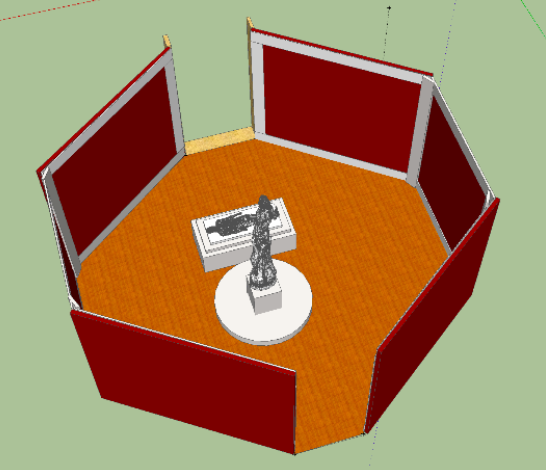
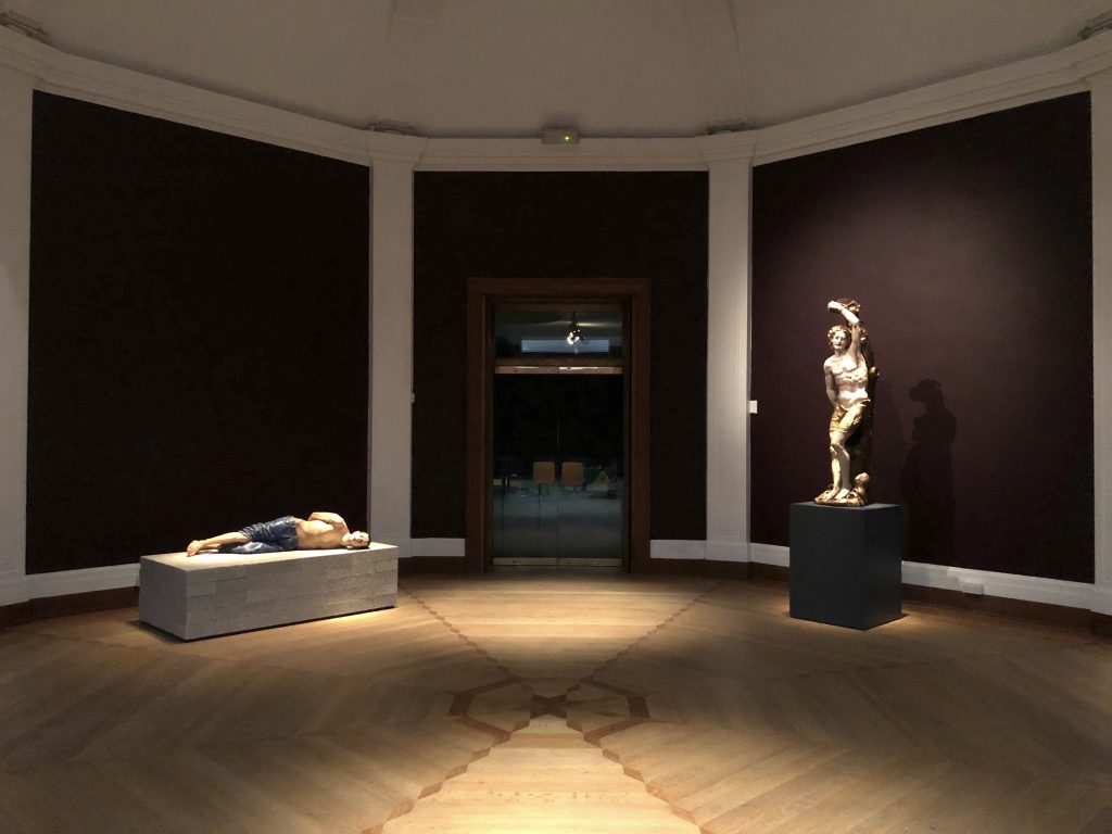
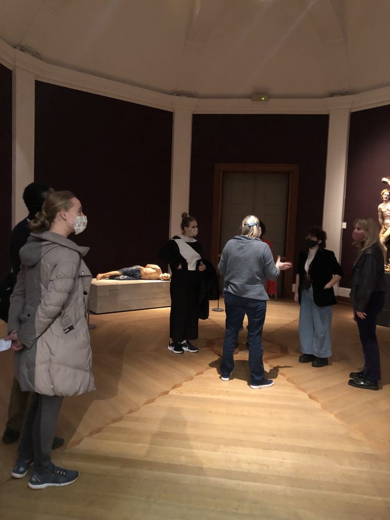
Much of what we do at the Fitz is ambitious in scope, planned several years in advance, executed on a large scale, and requiring a significant budget. This Sensual/Virtual sculpture display is quite the reverse, consisting of just two beautiful yet gritty works of art, deliberately juxtaposed in a simple and straightforward ‘compare and contrast’ display. It was planned during lockdown, without a budget, to be quick and easy to install, and for opening immediately after our big Feast & Fast exhibition closed. Happily, the one available space, the Octagon Gallery, was perfect: large enough to hold both sculptures and several socially-distanced visitors but not so grand as to risk dominating the under life-size sculptures, and diminishing their impact. Its octagonal floor-plan was also ideal, the encircling walls creating a protective womb-like, intimate and ‘safe’ space, to encourage close looking and self-reflection. And so was the pre-existing rich aubergine paint colour on the walls, creating a perfect warm and dark foil for the brightly painted statues.
Relative placement of the sculptures and didactic panels
Perhaps the most critical decision was establishing how the sculptures should relate to each other, and to the viewer. I considered various possible positions, including having both sculptures freestanding in the centre of the Octagon. While this would have permitted visitors to walk around them and see them from every angle, I felt this would bring the sculptures too close together, and neither would benefit from this overly close-up and personal encounter.
I also contemplated placing them against the two central walls, equidistant from both entrances and directly confronting each other across the gallery space. While this configuration provided the maximum distance between them, I also rejected this because it meant visitors ultimately having to turn their back on one statue, in order to properly engage with the other. It would also have meant placing the four didactic panels between the sculptures, which I felt would be too intrusive, and create visual confusion.
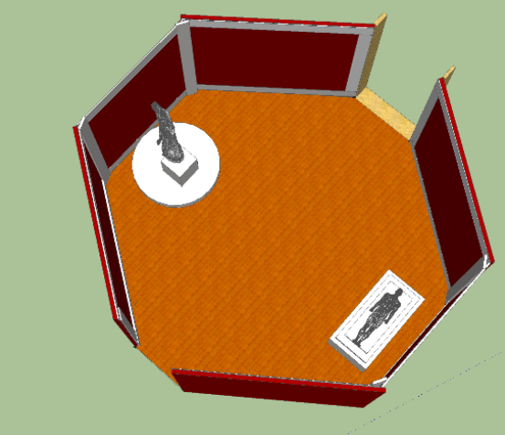
In the end, bearing in mind the single entry/exit point from the Spanish Gallery, the desirability of having the two juxtaposed sculptures ‘in uninterrupted conversation’ with one another, and the need to observe stringent social distancing rules, I decided to display them on the far return walls, so that while angled in towards one another, they were not on top of each other, being separated by the doorway leading out into the Twentieth Century Gallery. This also meant the didactic panels could be placed on the walls as one entered, two on each side, so these could (if desired) be read before moving further into the gallery space, to encounter the pendant sculptures in a text-free zone.
The question of open display
Although it would have been easier from a conservation and security point of view to have installed both sculptures inside cases, I was determined to avoid this, as even the best non-reflective glass creates a physical, and therefore also a psychological, barrier between the visitor and the work of art. In this display, it was essential that both sculptures occupied the same physical space as each other, which was also that of the viewer. That said, both sculptures are loans, and have extremely delicate painted surfaces, so we needed to protect them from touch and potential damage. This was done by mounting them on metre-high plinths, positioned fairly close to a wall, and by installing discrete but visible, knee-height tensile barriers around them at the required distance to prevent physical contact, but not spoil the visual choreography of the display.
Creating a dynamic and memorable encounter
All of the above decisions have led, I hope, to a dynamic and memorable encounter with the sculptures: as you approach the Octagon from the Spanish Gallery (as per the new, one-way, visitor route), you see at first only the St Sebastian on the far right return wall, but as you get closer to the entrance doorway, Action 125 suddenly comes into view on the far left return wall. When you step inside the Octagon, the first things you encounter are the didactic panels, which can be read before proceeding further into the heart of the Octagon. If you stand in the very centre of the floor, you can see both sculptures in a single ‘visual bite’; but as you move forwards, you are naturally drawn to approach one or the other, and are actively invited to look more closely at the individual statue, thanks to the dramatic lighting and the low-key use of barriers. As you leave the space, and look back over your shoulder, the St Sebastian slips from view, and the final haunting image you are left with is Action 125 sprawled helplessly on the ground.
The installation process explained
I’m often asked about how displays are physically put up in museums, so I decided to capture on camera the key installation of Sensual/Virtual: Two Coloured Sculptures. Although ‘an easy win’ on paper, consisting of just two free-standing sculptures, it still involved a huge amount of team work and forward planning, as well as some creative solutions on the spot, as you’ll see. And everything was, of course, made all the more challenging and time-consuming by the need for strict social distancing due to COVID-19, which is especially tricky to observe when installing heavy and fragile pieces of polychrome wood sculpture! So, with huge thanks to the fabulous in-house team, here’s how we got this particular show on the road.
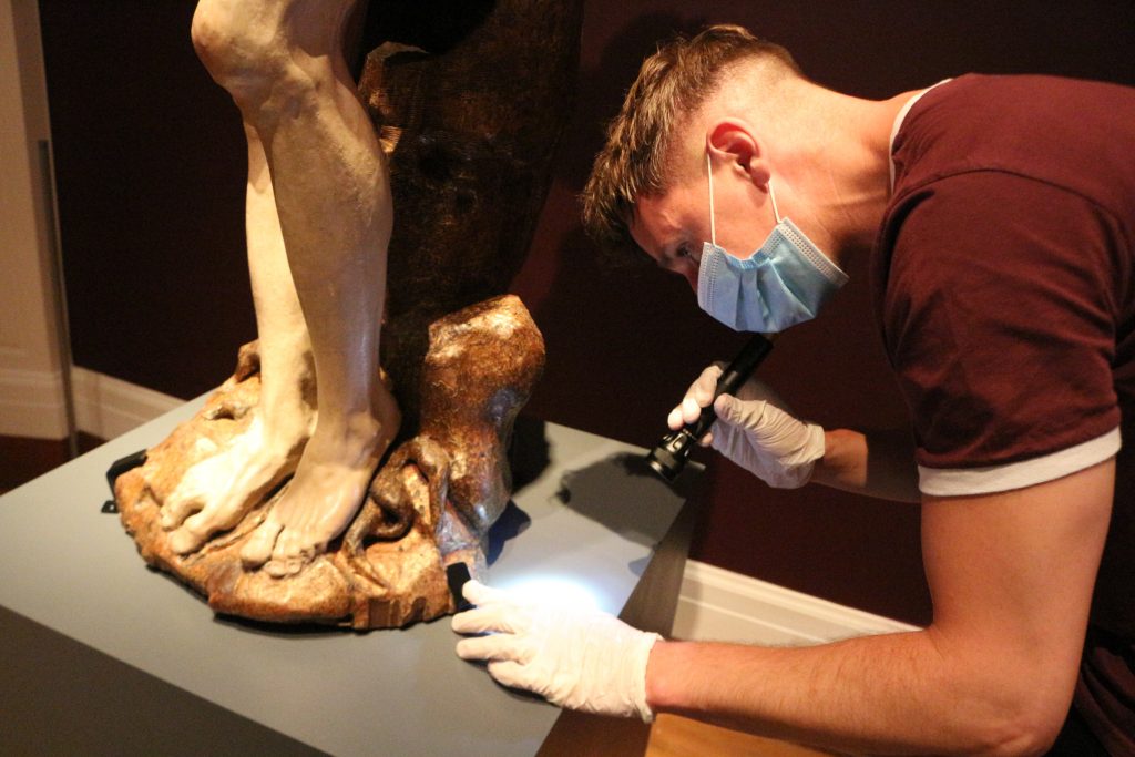
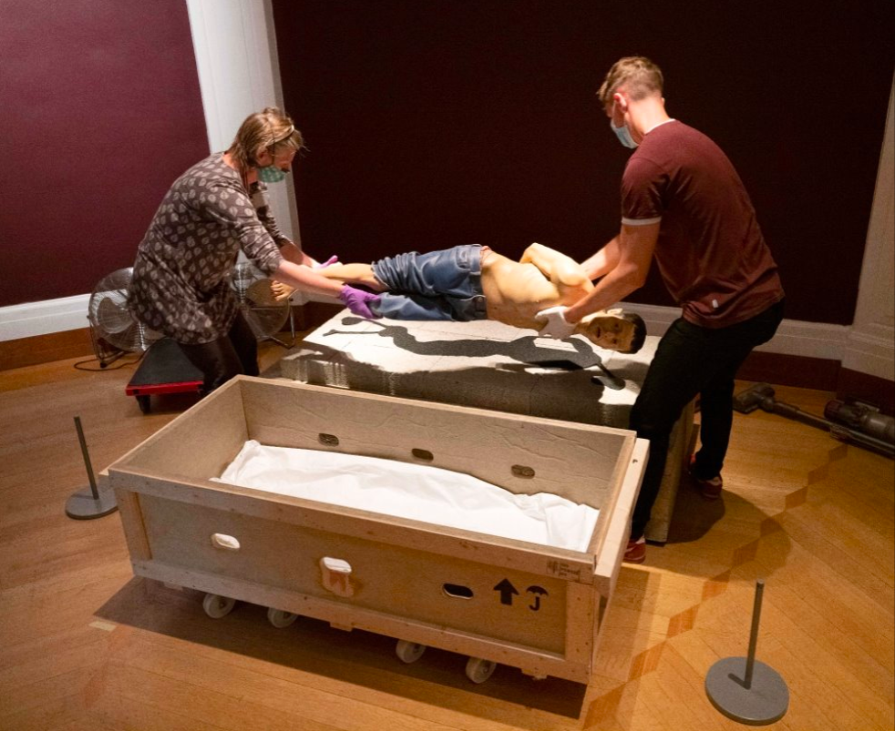
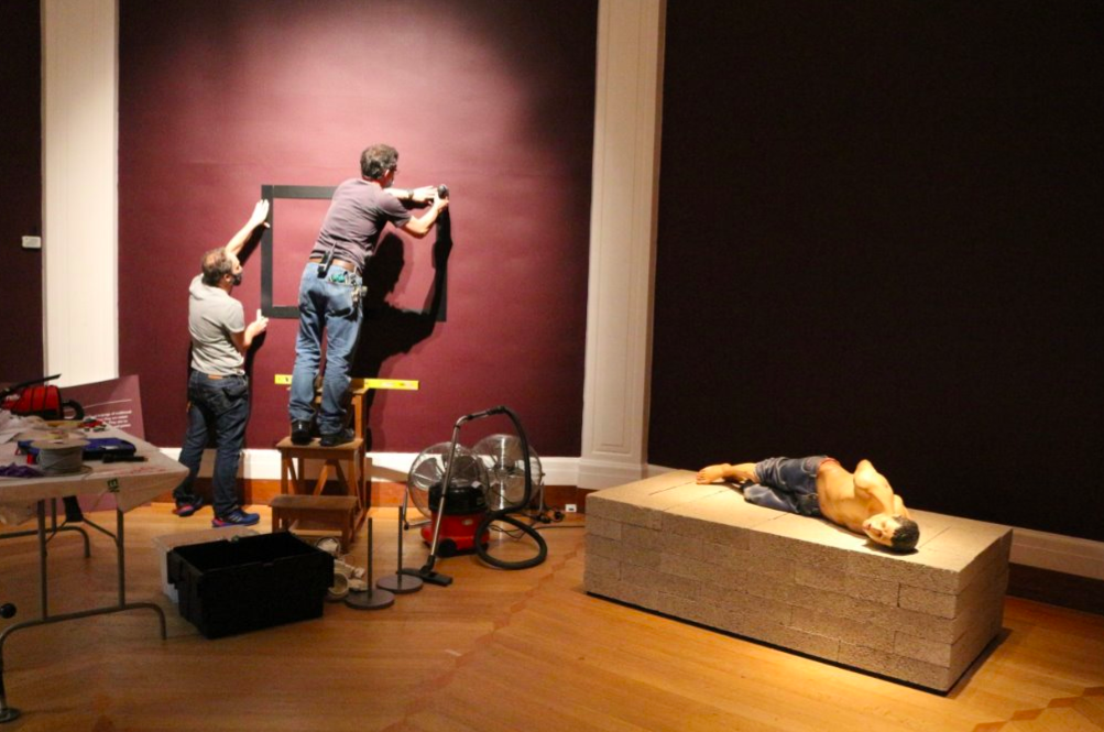
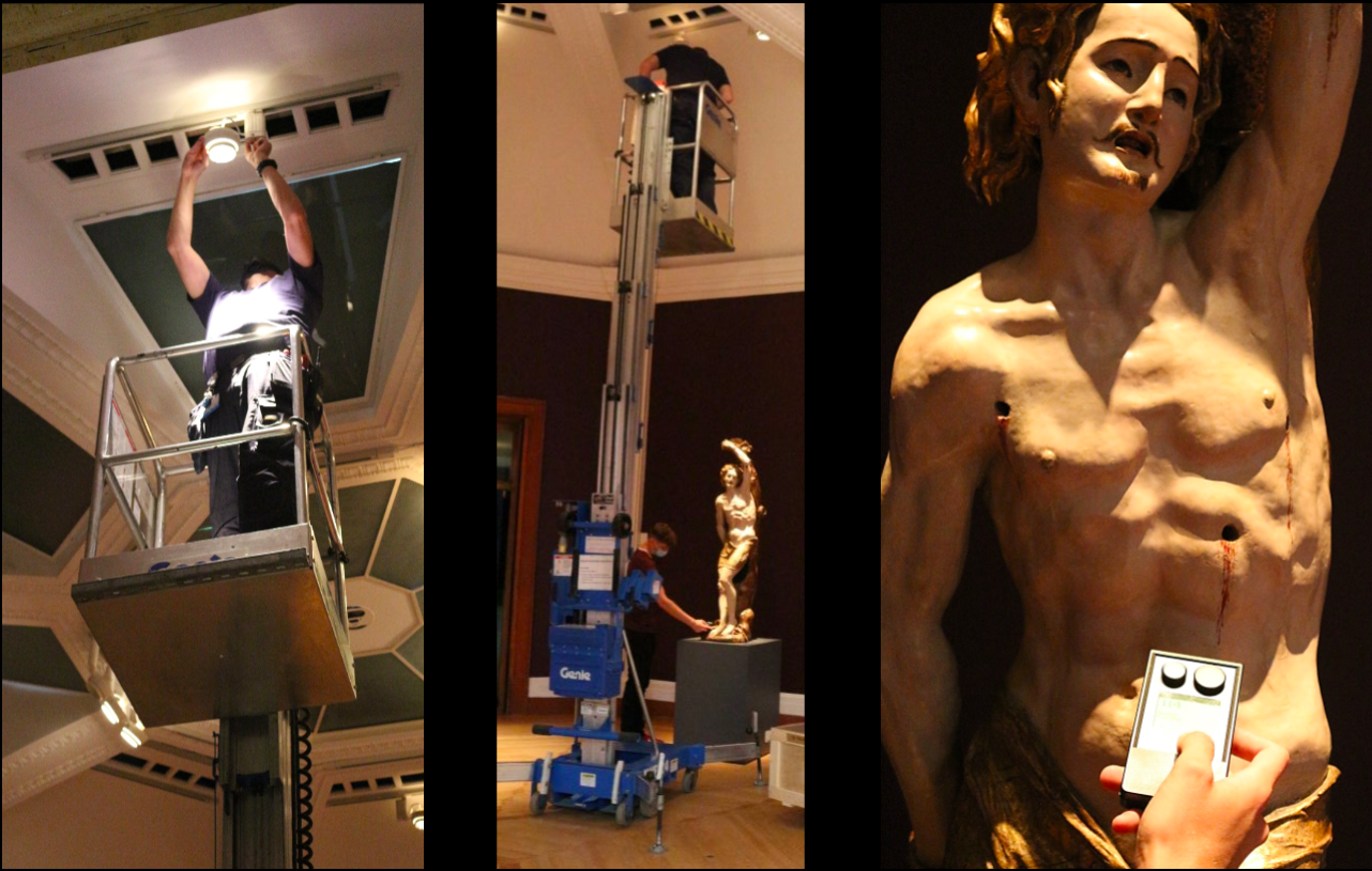
Both sculptures are loans and we are incredibly grateful to both owners for kindly lending them to us. Here you see the St Sebastian in its transportation crate, following delivery to the Museum and a 72-hour quarantine, being carefully opened by technician Timothy Matthews and conservator Sophie Rowe so it could slowly acclimatise to the environmental conditions of the Octagon.
Once acclimatisation had finished, and the plinth had been moved into place, it was time to remove St Sebastian from the crate. Tim and Sophie swiftly established the safest places for their hands, avoiding any areas with particularly vulnerable painted surfaces, and manually lifted the sculpture onto the lowered plate of the stacker, which had been covered with a protective layer of Tyvek. The stacker was then carefully wheeled in front of the plinth, and the plate painstakingly inched up until it was completely level with the top of the plinth.
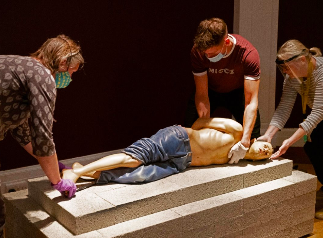
The statue was carefully manoeuvred off the plate and onto the top of the plinth, which had been overlain with a large sheet of strong Melinex film. This was to allow us to swivel the statue, once on its base, to the precise angle desired. We spent some time adjusting its final position to optimise its visual impact on both the incoming visitor and Action 125.
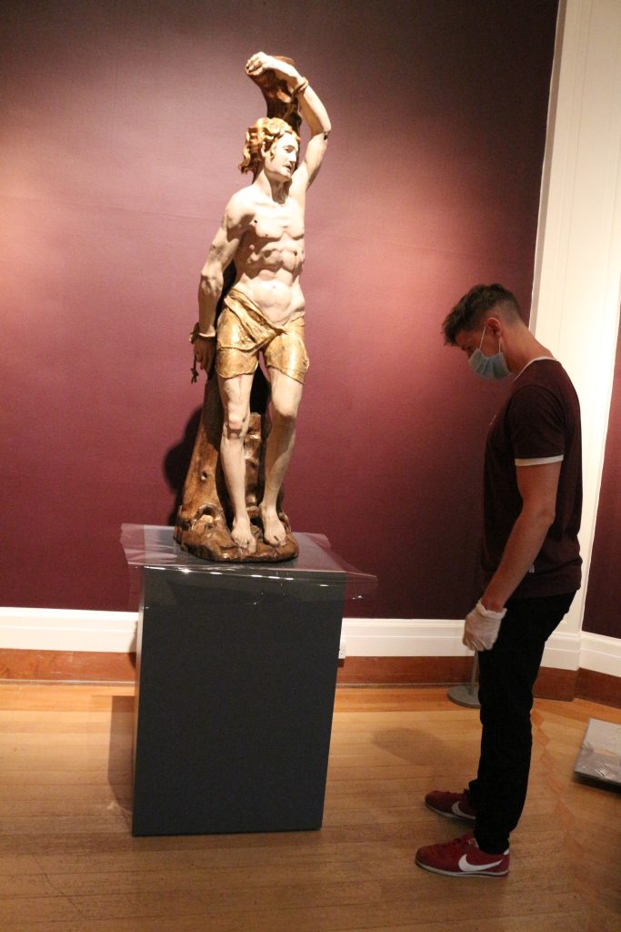
Once we were all happy, the Melinex film was removed, and Tim screwed several metal clamps around the base of the sculpture to secure it firmly in place. These had been skilfully hand-crafted by technician Andrew Maloney the week before to fit certain carefully chosen spots around the base. Andrew had also fitted thin sections of Plastazote foam on the insides of the metal clamps to prevent the metal from coming into direct contact with the sculpture’s delicate polychrome surfaces.
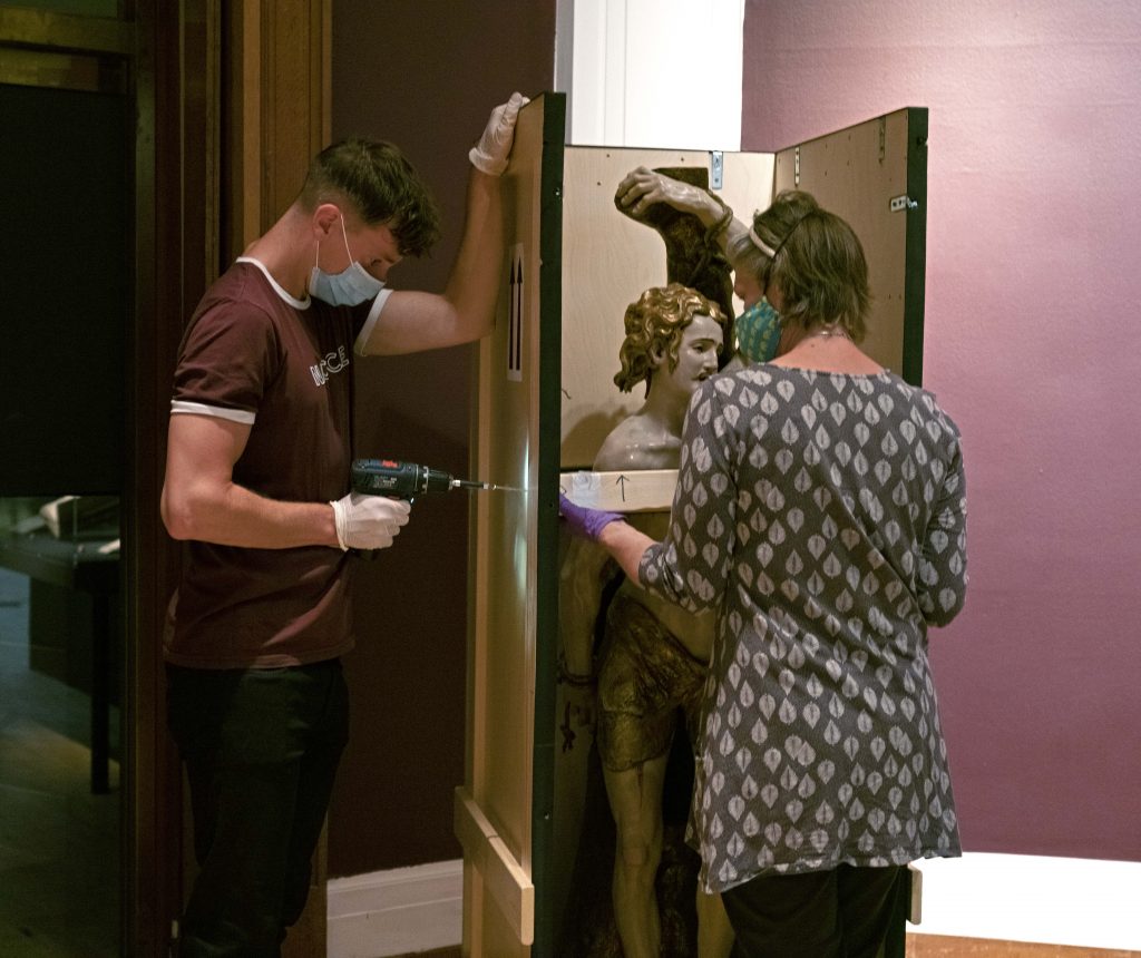
Once St Sebastian had been installed, we turned our collective attention to Action 125, which had also been acclimatising slowly to the new environment. Its installation involved a similar procedure but with a few additional steps because Reza Aramesh wanted to trial a new plinth. As you can see from the photo below, the original plinth of Action 125 was made from plain dark wood, with a stepped top carefully inlaid with ornate geometric patterns, derived from Islamic designs but also (to my mind) recalling the shape of barbed wire.
For its display in the Octagon Gallery, which has an inlaid wood floor, Reza (who is keen on contrasting materials) felt that a non-wood base would be more desirable and striking.
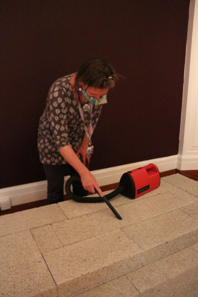
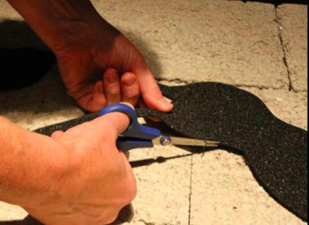
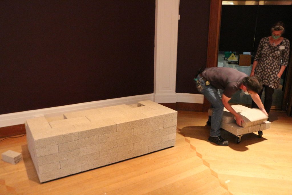
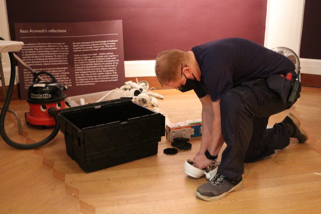
Our facilities supremo, Andrew Bowker, had kindly pre-ordered a consignment of breeze blocks and constructed these into a basic rectangular plinth using measurements sent over by Reza. To avoid particles of grit coming off the untreated concrete blocks and potentially damaging Action 125, Sophie diligently vacuumed all the exposed surfaces with the conservation vacuum cleaner, and for the first time that day was truly grateful for her face mask!
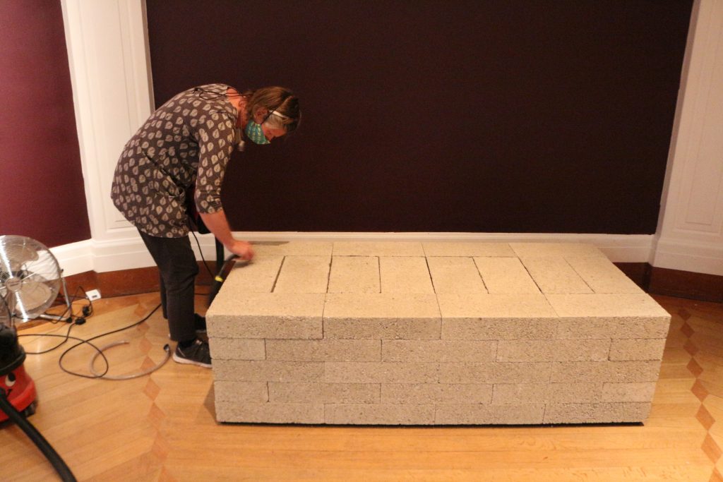
Because the surface of the individual blocks remained rather rough and gritty, we had to take steps to ensure that this would not damage the underside of Action 125. This involved Sophie creating a ‘contact point’ image from a thin sheet of Plastazote, to act as a buffer between the concrete and wood surfaces.
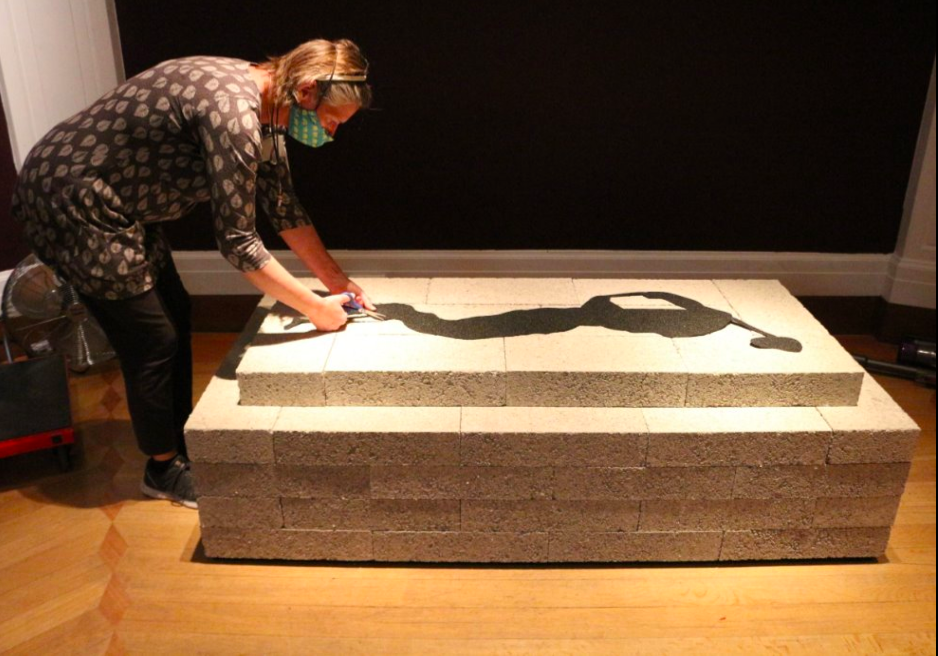
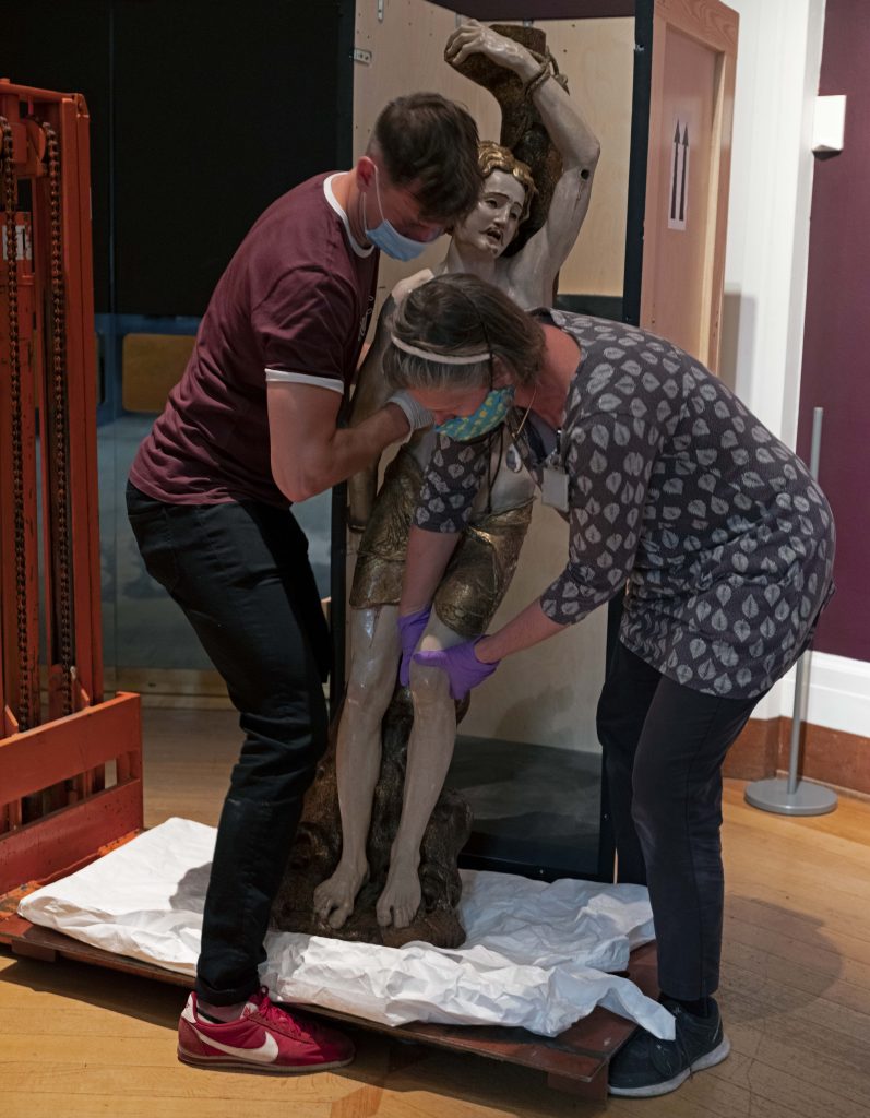
Once the Plastazote image had been perfected, Sophie and Tim carefully lifted Action 125 out of its crate and lowered it down, directly on top of the Plastazote ‘contact point’ image.
We then adjusted Action 125 to ensure it was correctly positioned on the protective Plastazote.
Although this base looked pretty good, after consultation with Reza, we collectively decided that its stepped design was potentially a bit too rarified, and Reza asked us if we would mind removing the step, thereby creating a plain rectangular plinth with four layers of breeze blocks.
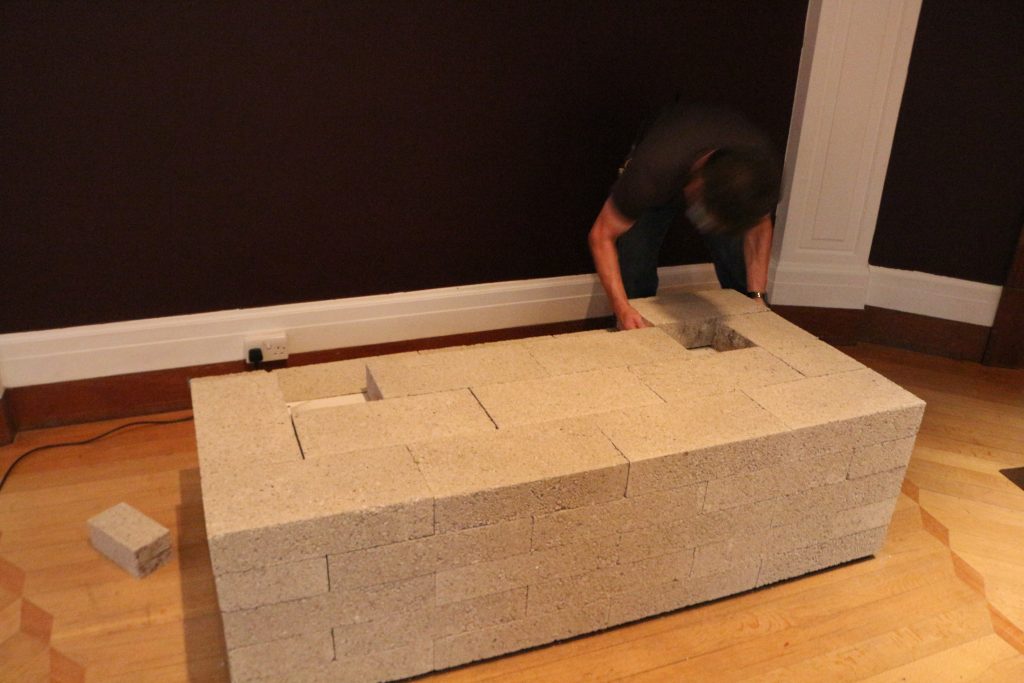
As before, we consulted with Reza, and we all came to the same conclusion pretty quickly that while this revised design was better in its starkness, it was now a bit too low for optimum viewing, and did not correspond as well as it might have done with the height of the plinth of St Sebastian. So Andy Bowker was recalled, and patiently added an additional layer of concrete blocks to raise the plinth to roughly knee-height. We all agreed that this was now the perfect solution, which couldn’t be bettered! Having got Reza’s sign off, the Plastazote ‘contact point’ image was positioned on top for the final time.
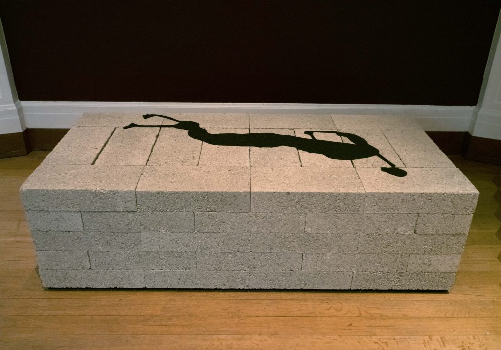
One real benefit of working our way through three different design solutions for the plinth, was the chance it gave us to rethink the position of Action 125 on it. In the first iteration, head and body had been aligned with the front face of the base. But Reza felt this lacked dynamism, so asked us to experiment with different alignments. As you can see in the final arrangement, we placed the figure much more diagonally, with its head daringly close to the front right corner, and its legs pushed towards the back left corner, which resulted in a more spontaneous and less contrived effect.
The didactic panels
Another critical part of the display is, of course, the didactic material, which is there to assist visitors with understanding, interpreting and engaging with the works of art. However, labels are notoriously hard to get right, both in terms of content and tone, and design. Some visitors wanting them very large, others commenting that they spoil the look of the display.
In terms of aesthetic feel of Sensual/Virtual: Two Coloured Sculptures, I wanted to create a minimalist, almost stark, space: just two sculptures, beautifully spot-lit, and four easy-to-read didactic panels. In terms of text design, we wanted a crisp, clean, calm look with an easy-to-read san serif font. In terms of the colour of the text and background, maximum contrast of text to background is essential for legibility (as well as correct font size), so we considered two options: classic black text on white background, and more experimental white text on aubergine, colour-matched to the walls. Our talented in-house designer, Ayshea Carter, kindly made me two mock-ups and I discussed these with the Director, Luke Syson, David Evans (Exhibitions Manager) and Miranda Stearn (Head of Learning), and we all felt the white-on-aubergine was preferable, as the background disappeared elegantly into the walls, leaving the words very prominent. (In the other design, the white background became an overly dominant presence on the walls, and competed unhelpfully with the text).
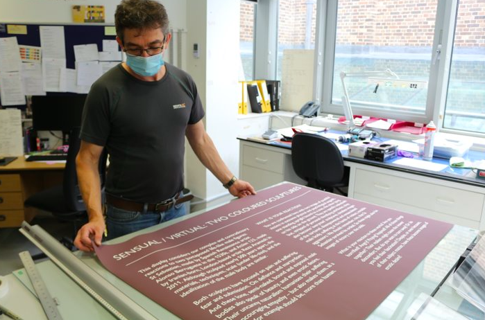
These four panels were then printed out by Mike Jones (Head of Photography) on the Museum’s enormous laser printers at A0 landscape size (118.9 x 84.1 cm) with the text at a very legible 66 point font-size. These were taken over to the Paintings Department workshop where Andy Bowker (yes, he really does get everywhere!) devised an ingenious new backing system to allow them to be mounted on the walls without damaging the paint work.
We also thought carefully about the best height for the panels, opting for a comparatively low hang so that the text would be easily legible for visitors in wheel-chairs and children. With positions established, the backing system was affixed onto the walls, and the didactic panels mounted in place.
Let there be light!
Another absolutely critical part of the installation is the lighting. On the one hand, we wanted to create a very dramatic visual effect, but on the other, we were duty bound to adhere to strict conservation guidelines to ensure that the sculptures were not exposed to more than an absolute maximum of 150 lux. Lighting in the Octagon is not easy due to the limited ceiling tracks where spots can be affixed, but our ever-creative electrician Darren Potter worked his usual magic and through repeated trips on the cherry picker to the highest reaches of the ceiling, and judicious placement of a range of different bulbs, he was able to achieve a very satisfactory result.
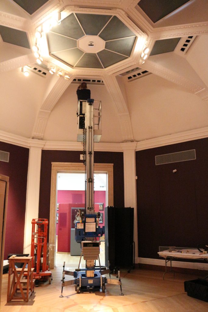
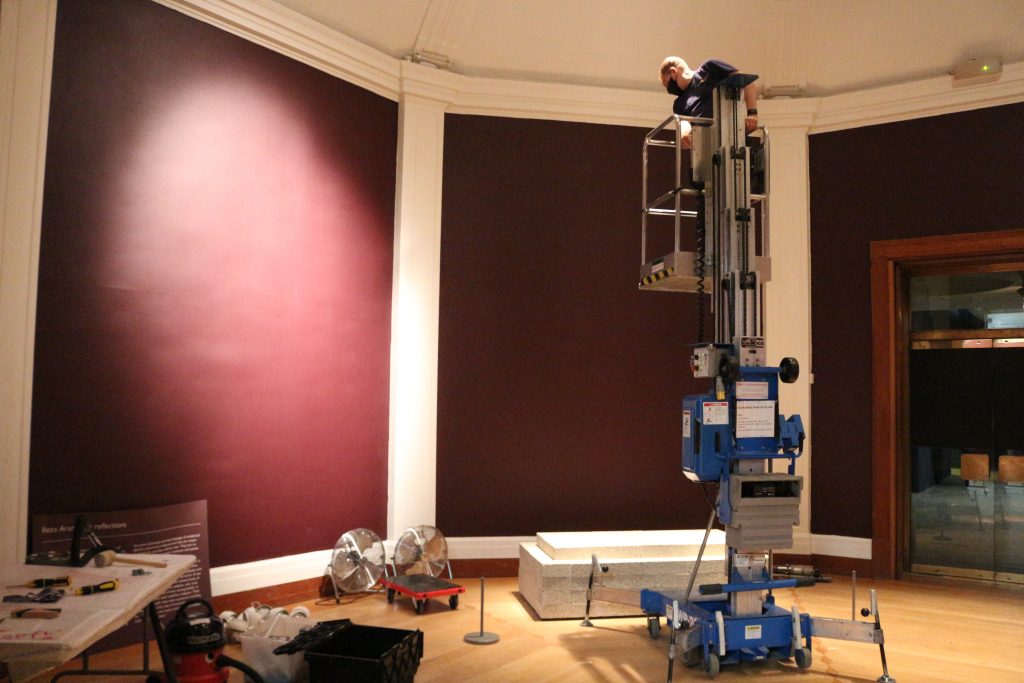
Yet again teamwork was vital: while Darren was up in the heavens, I moved around double-checking the effects and indicating where more or less light was needed, and Tim stood guard by the sculptures, operating the light meter. This handheld device instantaneously records the amount of light falling onto a particular area, and if the levels registered are too high, then the offending lamps can be re-angled and/or dimmed until the correct lux levels are reached.
Lights, camera, action!
Finally, last but absolutely not least, is the photography of the installation. Mike Jones, with Katie Young (another of the Museum’s talented photographers) had been present throughout the day capturing ‘fly on the wall’ shots at my request for use in this blog and other educational outputs. Once installation was complete, and just before the low tensile barriers were erected, Mike returned to the gallery to take a set of installation images, needed by curators and the Learning Team for teaching and engagement, by the Digital Team for the website, and by Press and Marketing for promotional purposes. Such images are not only vital for the historical record, but they also permit people to see and appreciate displays even if they cannot make an in-person visit. This is particularly vital now during the current pandemic when many people are sadly unable to visit the Fitz due to lockdown rules, and when the Museum is having to strictly limit the numbers of visitors on site at any one time.
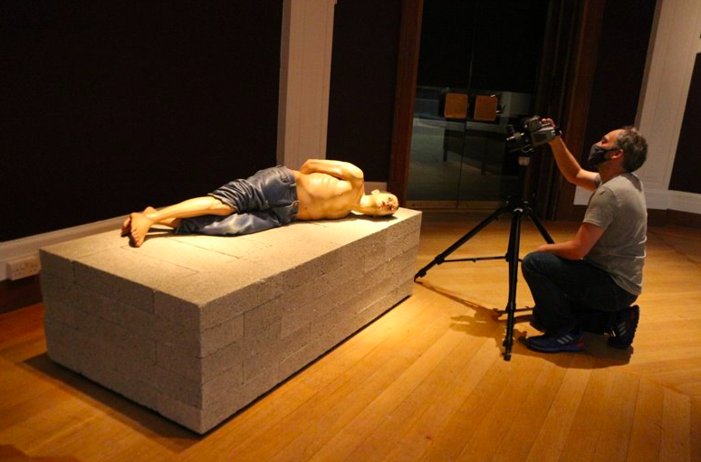
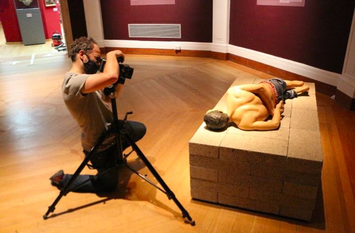
And here you can see one of Mike’s brilliantly moving and compelling images, which really captures the drama and intensity of Action 125, as well as its hyper-realism and irresistible tactility.

Visitor reactions
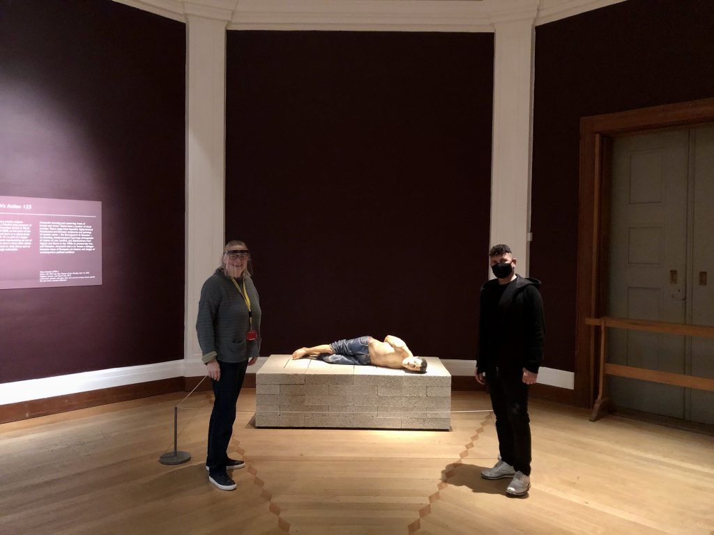
Well done for making it to the end of this epic blog! I hope that everything I’ve said above helps you to really appreciate the huge amount of decision-making, forward planning, and real team work that goes into even the smallest of displays. Happily, our efforts have paid off: Sensual/Virtual: Two Coloured Sculptures has enjoyed great footfall to date, and front of house staff have reported real curiosity and engagement.
Anonymous visitor reactions include the following comments: “I came to see the temporary exhibition of the sculpture by Reza Aramesh and the Renaissance St Sebastian. It was exceptionally good” (24 September); and “The Reza Aramesh installation is stunning. Gave me lots to think about” (7 October). Staff have reported a lot of young adults enjoying and discussing the displays, with one group fascinated by the bleeding arrow-holes in the St Sebastian and commenting how, “They really make you feel his pain”. Many have commented on man’s inhumanity to man, and debate has arisen over the different feelings aroused. When I was visiting the display with Reza Aramesh a couple of weeks ago, I was delighted to see a group of teenagers in animated discussion, and taking what appeared to me to be an incredible number of snaps on their cell phones and immediately sharing these with friends. But perhaps the most pleasing reaction of all for me was that recorded on 18 October by a member of the front of house team: “Child ran in and tried to lift the head of Action 125.” While we don’t encourage touching, a curator really couldn’t wish for a more genuine, heartfelt reaction. Clearly a deep connection had been made in that young, fertile mind.
Although the exhibition closed on Sunday 25 October, you can still explore it online. Please do let us have your reaction!
